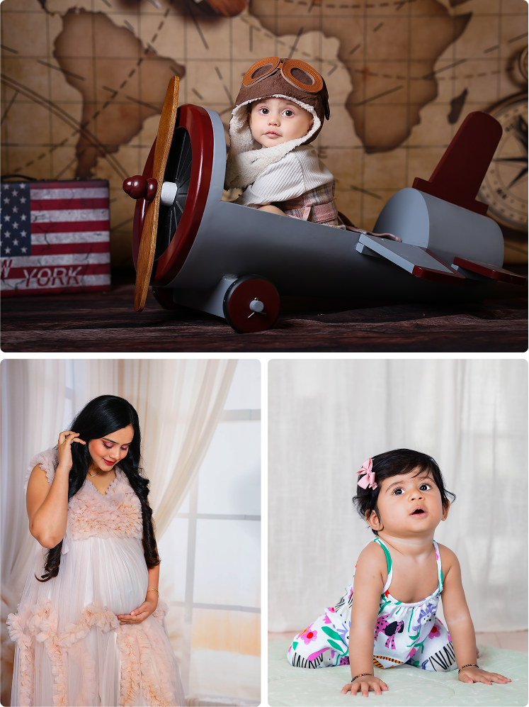
When parents plan a baby photoshoot, they often focus on:
- Outfits
- Props
- Themes
- Poses
- Photographer selection
But one detail quietly influences the entire mood and beauty of the final photographs, the color theme.
The right color palette can make baby photos look:
- Timeless
- Elegant
- Emotional
- Premium
- Visually balanced
At the same time, poor color choices can make photographs feel:
- Distracting
- Overwhelming
- Outdated
- Visually cluttered
Professional baby photographers understand that colors are not chosen randomly. Every shade used in a baby photoshoot affects:
- Mood
- Emotional warmth
- Skin tone appearance
- Overall visual storytelling
For parents in Bangalore, especially those booking professional baby photoshoots, understanding color coordination can significantly improve the final photography results.
If you want your baby’s photos to feel beautiful for years, not just trendy today, this guide will help you choose the perfect color themes for your baby photoshoot.
Why Color Themes Matter in Baby Photography
Colors create emotional responses.
Without realizing it, viewers associate different colors with different feelings.
For example:
- Soft neutrals feel calm and timeless
- Pastels feel gentle and emotional
- Bright colors feel energetic and playful
In baby photography, colors should support the emotional tone of the session rather than overpower it.
A well-planned color theme helps:
- Highlight baby expressions
- Create visual harmony
- Improve photo consistency
- Enhance emotional storytelling
The Goal of a Good Color Theme
A successful baby photoshoot color palette should:
- Keep the focus on the baby
- Complement skin tones
- Match the session mood
- Feel visually balanced
- Look timeless over the years
Professional photographers rarely choose colors based only on trends. Instead, they focus on emotional and visual harmony.
Why Neutral Colors Are So Popular
One major trend in modern baby photography is the use of neutral tones.
Popular neutral shades include:
- Beige
- Cream
- White
- Soft brown
- Ivory
- Warm grey
Why Neutrals Work Beautifully
Neutral colors:
- Keep attention on emotions
- Create timeless elegance
- Work well with soft lighting
- Match almost every skin tone
This is why many professional baby photography studios in Bangalore use neutral-themed setups.
Soft Pastels Create Emotional Warmth
Pastel tones are another favorite choice in baby photography.
Popular pastel shades include:
- Baby pink
- Powder blue
- Mint green
- Lavender
- Peach
- Soft yellow
Why Parents Love Pastels
Pastels create:
- Gentle emotional atmosphere
- Soft visual appearance
- Calm and comforting mood
They work especially well for:
- Newborn photography
- Milestone sessions
- Family portraits
Pastels also photograph beautifully under studio lighting.
Earthy Tones Are Becoming a Modern Trend
Recently, earthy tones have become extremely popular in baby photography.
These include:
- Rust
- Olive green
- Terracotta
- Warm beige
- Soft mocha
- Dusty brown
Why Earthy Colors Feel Premium
Earth tones create:
- Warmth
- Natural elegance
- Sophisticated visual balance
Many parents now prefer earthy color palettes because they look:
- Stylish
- Minimalist
- Timeless
without appearing overly bright or trendy.
Avoid Extremely Bright Colors
One of the biggest mistakes parents make is choosing overly bright colors such as:
- Neon green
- Fluorescent pink
- Bright orange
- Electric blue
Why Bright Colors Don’t Work Well
Very bright shades:
- Distract attention from the baby
- Reflect harshly on skin tones
- Create visual imbalance
Professional photographers usually recommend softer tones because they create more emotional and elegant photographs.
Match Colors With the Baby’s Age
The baby’s developmental stage also affects color choices.
Newborn Sessions
Best colors:
- Cream
- White
- Soft beige
- Muted pastels
These tones support the peaceful newborn mood.
6-Month Milestone Sessions
At this stage, babies become more expressive.
You can introduce:
- Slightly richer tones
- Warm earthy shades
- Playful but soft colors
First Birthday Sessions
First birthday shoots often allow:
- More vibrant themes
- Celebration colors
- Cake smash styling palettes
Still, maintaining balance is important.
Choosing Colors Based on Photography Style
Different photography styles suit different color themes.
Minimalist Photography
Minimalist baby photography works best with:
- Neutral tones
- Whites
- Beige palettes
- Soft textures
This style focuses heavily on emotion and simplicity.
Lifestyle Photography
Lifestyle baby sessions often use:
- Earthy tones
- Natural textures
- Warm home-inspired colors
These setups feel realistic and emotionally connected.
Traditional Indian Themes
For Indian cultural or festive photoshoots, photographers may use:
- Maroon
- Gold
- Deep green
- Mustard
- Traditional silk tones
However, balance remains important to avoid visual overload.
Coordinating Family Outfits With Baby Themes
One important factor parents forget is coordination between:
- Baby outfits
- Parent clothing
- Background colors
Everyone’s outfits should feel visually connected.
Example:
If the baby wears soft beige:
- Parents can wear cream, white, or warm brown tones
This creates harmony without looking overly “matched.”
Why Monochrome Themes Look Elegant
Monochrome styling means using different shades of the same color family.
For example:
- Cream + ivory + beige
- Soft blue + grey + white
Benefits of Monochrome Styling
- Creates visual sophistication
- Looks timeless
- Maintains emotional softness
This style is extremely popular in premium baby photography.
Seasonal Color Themes for Baby Photoshoots
Many parents enjoy seasonal color coordination.
Summer Themes
Best colors:
- Soft yellow
- Peach
- White
- Sky blue
Rainy Season Themes
Ideal tones:
- Warm earthy shades
- Soft greens
- Neutral cozy textures
Winter-Inspired Indoor Themes
Popular choices:
- Cream
- Warm brown
- Soft burgundy accents
These seasonal palettes create emotional warmth in photographs.
Why Background Color Matters
Backgrounds influence how all colors appear in photographs.
Light Backgrounds
Create:
- Airy feel
- Soft emotional atmosphere
- Timeless elegance
Dark Backgrounds
Create:
- Dramatic depth
- Emotional intensity
- Artistic portraits
Professional photographers carefully balance outfit and background colors together.
Skin Tone Compatibility Matters
Certain colors flatter different skin tones more naturally.
Warm Skin Tones
Usually work beautifully with:
- Beige
- Olive
- Rust
- Warm creams
Cooler Skin Tones
Often suit:
- Soft blue
- Lavender
- Grey tones
Professional photographers often recommend shades that naturally complement family skin tones.
Why Less Is More in Color Selection
One of the biggest secrets in baby photography styling is restraint.
Too many colors can:
- Create distraction
- Reduce emotional focus
- Make photos feel cluttered
Most timeless baby photos use:
- 2–3 coordinated shades maximum
This creates visual simplicity and elegance.
How Props Should Match Color Themes
Props should support the palette rather than dominate it.
For example:
- Neutral blankets
- Soft textured baskets
- Minimal floral accents
All elements should feel visually connected.
Professional photographers carefully style props according to the chosen theme.
Why Color Consistency Matters in Milestone Photography
For monthly milestone sessions, maintaining color consistency creates beautiful visual storytelling.
Using similar:
- Tones
- Background styles
- Textures
helps parents clearly see the baby’s growth journey.
This consistency creates emotional impact when photos are viewed together later.
The Psychology of Soft Colors in Baby Photography
Soft colors create:
- Calmness
- Warmth
- Comfort
- Emotional connection
That’s why most professional baby photography avoids aggressive or highly saturated palettes.
The goal is emotional storytelling, not visual overload.
Why Professional Studios Help With Color Planning
Professional baby photographers understand:
- Lighting behavior with colors
- Color harmony
- Fabric textures
- Theme coordination
Studios in Bangalore often guide parents with:
- Styling recommendations
- Outfit coordination
- Setup matching
This professional support dramatically improves final photo quality.
Timeless Colors vs Trendy Colors
Trendy colors may feel exciting temporarily.
But timeless colors create photographs that still feel elegant:
- 5 years later
- 10 years later
- Even decades later
That’s why professional photographers prioritize:
- Simplicity
- Emotional warmth
- Soft visual balance
over temporary trends.
Final Thoughts
Choosing the right color theme for your baby photoshoot is about much more than aesthetics.
The right palette helps create:
- Emotional warmth
- Timeless beauty
- Elegant storytelling
- Visual harmony
Whether you choose:
- Soft neutrals
- Gentle pastels
- Warm earthy tones
- Minimal monochrome palettes
The goal should always remain the same: to keep the focus on your baby’s emotions, expressions, and precious moments.
For parents, professional baby photography studios can help create beautifully coordinated setups that preserve your baby’s memories in the most elegant and timeless way possible.
Because years later, beautifully chosen colors do more than make photos look attractive.
They help those memories continue feeling warm, emotional, and alive forever.