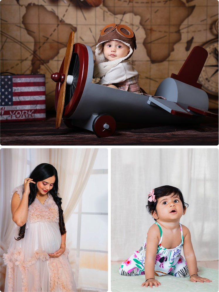
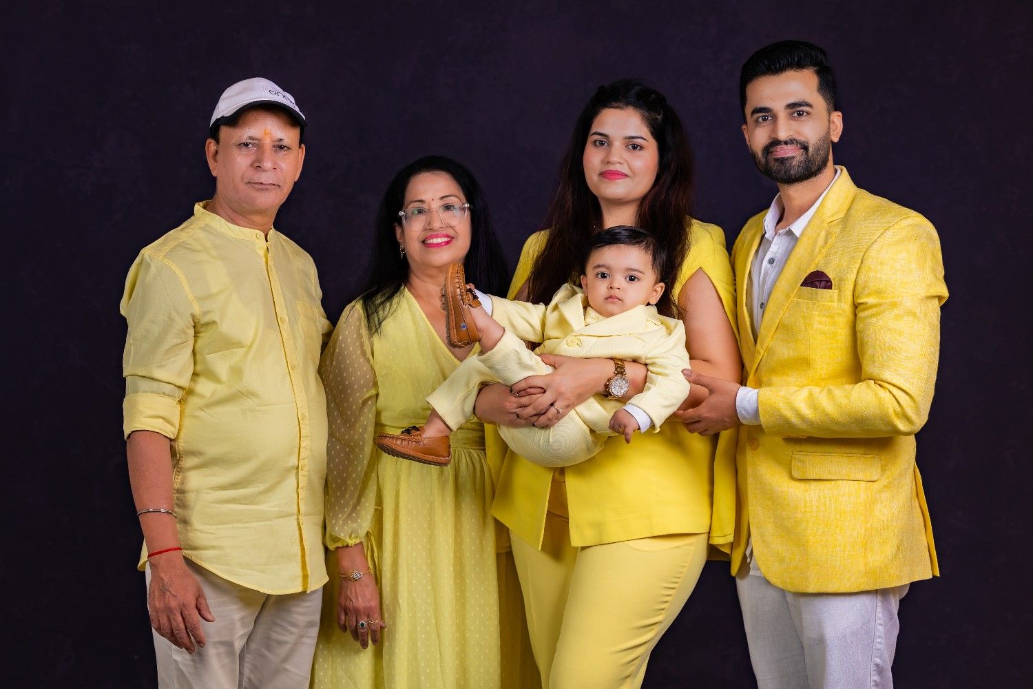
Family photoshoots with babies are not just about taking pictures; they are about preserving emotions, relationships, and moments that become more valuable every year.
From tiny baby smiles to emotional parent interactions, every detail matters during a family photoshoot. But one factor that quietly influences the overall beauty of the final images is something many parents underestimate: outfit colors.
The colors your family wears can completely change how photographs feel.
The right color combinations can make family portraits look:
- Warm and emotional
- Elegant and premium
- Soft and timeless
- Visually balanced
Meanwhile, poor color choices can make photos appear:
- Distracting
- Overwhelming
- Uncoordinated
- Outdated within a few years
Professional baby photographers understand that choosing the right outfit colors is not about fashion trends alone. It is about creating visual harmony that keeps the focus on family connection and the baby’s expressions.
For parents, especially those planning professional baby and family photoshoots, selecting the right color palette can make a major difference in how beautifully the memories are preserved.
If you want your family portraits to remain timeless for years, here are the best outfit color ideas and styling strategies for family photoshoots with babies.
Why Outfit Colors Matter in Family Photography
Colors influence:
- Mood
- Emotional tone
- Visual balance
- Skin tone appearance
- Photography aesthetics
In family photography, outfit colors should help create emotional storytelling rather than distract attention.
The best family photos usually feel:
- Soft
- Coordinated
- Natural
- Emotion-focused
This happens when colors work together harmoniously.
The Goal of Family Photoshoot Styling
The purpose of outfit coordination is not to make everyone look identical.
Instead, the goal is to:
- Create visual connection
- Highlight emotional interactions
- Keep attention on faces and expressions
- Ensure timeless appeal
Professional photographers always prioritize emotional storytelling over fashion overload.
Why Neutral Colors Always Work Beautifully
Neutral colors remain one of the safest and most timeless choices for family photoshoots with babies.
Popular neutral shades include:
- Beige
- Cream
- White
- Soft grey
- Warm brown
- Ivory
Why Neutrals Look So Elegant
Neutral palettes:
- Keep the focus on emotions
- Match almost every background
- Work beautifully with studio lighting
- Create timeless visual softness
This is why many professional baby photography studios prefer neutral styling themes.
Beige and Cream: The Most Timeless Combination
One of the most loved family photoshoot palettes is:
- Beige
- Cream
- Ivory
- Soft white
Why Parents Love These Shades
These tones create:
- Emotional warmth
- Softness
- Premium visual feel
They also complement babies beautifully because:
- Baby skin tones appear softer
- Expressions stand out naturally
- The photos age gracefully over time
This combination works especially well for:
- Newborn photography
- Lifestyle sessions
- Indoor studio shoots
Soft Pastels Create Emotional Family Portraits
Pastel tones are another excellent option for family baby photography.
Popular pastel shades include:
- Powder blue
- Blush pink
- Sage green
- Lavender
- Peach
- Dusty mint
Why Pastels Work Well
Pastels create:
- Calm emotional atmosphere
- Gentle visual softness
- Natural warmth
They photograph beautifully in both:
- Indoor studio sessions
- Outdoor natural-light shoots
Pastels are especially ideal for milestone baby sessions.
Earthy Tones Are Trending in Modern Family Photography
Earthy palettes have become extremely popular in premium photography.
Popular earthy tones include:
- Rust
- Olive green
- Terracotta
- Mocha
- Camel brown
- Warm taupe
Why Earthy Colors Feel Sophisticated
Earth tones create:
- Rich emotional warmth
- Natural elegance
- Contemporary minimalism
Professional photographers love earthy palettes because they look:
- Stylish
- Organic
- Timeless
without appearing overly trendy.
Soft Blue and White: A Classic Family Combination
Blue tones work beautifully in family photography because they feel:
- Calm
- Fresh
- Clean
- Emotionally balanced
Best Shades of Blue
Instead of bright blue, choose:
- Dusty blue
- Powder blue
- Steel blue
- Muted navy
Paired with white or cream, blue tones create elegant family portraits.
Why Monochrome Styling Looks Premium
Monochrome styling means using multiple shades from the same color family.
Example:
- Cream + beige + tan
- Grey + white + charcoal accents
Benefits of Monochrome Styling
- Creates visual sophistication
- Looks highly polished
- Maintains emotional softness
Professional photographers often recommend monochrome palettes because they photograph beautifully under studio lighting.
Avoid Extremely Bright Colors
One of the biggest styling mistakes families make is choosing:
- Neon shades
- Fluorescent tones
- Very saturated colors
These colors can:
- Distract from emotional moments
- Reflect onto skin tones
- Create harsh visual contrast
Professional photographers usually avoid extremely bright palettes because they overpower baby expressions.
Why Black Needs Careful Balance
Black can look elegant in moderation.
However, too much black may:
- Make photos feel visually heavy
- Reduce softness
- Pull attention away from the baby
Better Approach
Use black as:
- Accent tones
- Layered elements
- Supporting pieces
while balancing with softer shades like:
- Beige
- Cream
- Grey
Coordinating Family Colors Without Matching Exactly
Modern family photography avoids identical outfits.
Instead of everyone wearing the same color, choose:
- Coordinated shades
- Complementary tones
- Similar visual warmth
Example Palette:
- Mom: Cream
- Dad: Beige
- Baby: Soft brown or ivory
This creates natural harmony while keeping the photos visually dynamic.
Why Texture Matters Along With Color
Texture affects how colors appear in photographs.
Soft textures create:
- Depth
- Warmth
- Emotional softness
Great fabric choices include:
- Cotton
- Linen
- Knits
- Soft-flowing fabrics
Avoid overly shiny materials because they reflect studio lighting harshly.
Best Color Themes for Indoor Studio Sessions
Indoor studio baby photography usually works best with:
- Neutrals
- Warm earthy tones
- Soft monochrome palettes
Why?
Because studio lighting enhances:
- Warm textures
- Gentle colors
- Emotional softness
Studios often recommend soft palettes for timeless indoor portraits.
Best Color Themes for Outdoor Family Sessions
Outdoor photography allows slightly richer tones because natural surroundings already add visual texture.
Best outdoor palettes:
- Olive green + cream
- Dusty blue + beige
- Rust + ivory
- Soft mustard + white
These combinations work beautifully in Bangalore’s parks and outdoor locations.
Seasonal Color Suggestions for Bangalore Families
Summer Sessions
Best colors:
- White
- Peach
- Light blue
- Cream
These shades keep photographs airy and fresh.
Rainy Season Sessions
Ideal colors:
- Olive
- Warm beige
- Earthy browns
- Soft greys
These palettes create cozy emotional warmth.
Why Baby Outfits Should Stay Simple
In family photography, the baby should remain the emotional center of the image.
That’s why baby outfits should usually be:
- Comfortable
- Minimal
- Softly colored
Avoid:
- Heavy graphics
- Loud patterns
- Distracting accessories
Simple baby styling creates timeless emotional portraits.
Traditional Indian Family Color Themes
For Indian family portraits, traditional styling can look beautiful when balanced carefully.
Elegant traditional combinations include:
- Maroon + beige
- Sage green + cream
- Mustard + ivory
- Soft gold + neutral tones
The key is maintaining softness and avoiding excessive visual clutter.
Why Professional Styling Guidance Helps
Professional photographers understand:
- Lighting behavior
- Color harmony
- Skin tone balance
- Visual composition
Studio often guide families with:
- Outfit planning
- Color palette coordination
- Theme styling suggestions
This helps ensure final photos look polished and timeless.
Common Color Mistakes Families Should Avoid
Too Many Colors
Using too many shades creates visual confusion.
Heavy Prints
Patterns distract attention from emotional storytelling.
Trend-Based Styling
Trendy colors may look outdated quickly.
Ignoring Background Coordination
Outfit colors should complement the photoshoot environment.
Why Timeless Colors Matter More Than Trends
Family photographs become more valuable over time.
That’s why timeless styling matters more than temporary fashion trends.
Soft and coordinated colors help photographs continue feeling:
- Elegant
- Emotional
- Relevant
even decades later.
The Psychology Behind Soft Family Color Palettes
Soft colors naturally create:
- Calmness
- Emotional warmth
- Intimacy
- Connection
That’s why professional family photography usually avoids aggressive or overpowering tones.
The goal is always emotional storytelling.
Final Thoughts
Choosing the right outfit colors for a family photoshoot with babies is not about looking fashionable, it’s about preserving emotions beautifully.
The best family portraits happen when colors create:
- Harmony
- Warmth
- Simplicity
- Timeless elegance
Whether you choose:
- Neutral palettes
- Pastel tones
- Earthy shades
- Monochrome styling
the focus should always remain on your family connection and your baby’s precious expressions.
For parents, professional baby photography studios can help guide color coordination to create emotionally rich and visually timeless family portraits.
Because years later, the best family photographs are not remembered for trendy outfits.
They are remembered for the love, warmth, and togetherness they captured forever.